BRAND.MILLASTAR / Midnight Gold
One identity.
Many expressions.
A living design direction for MILLASTAR: deep midnight blue, warm gold, purposeful typography and a constellation of ideas.
01 / Identity
Connected,
not identical.
The constellation connects our people and projects while leaving room for individual character.
Working brand direction. The simplified web star is a supporting motif, not the final lion-and-crown emblem master.

02 / Colour
Midnight meets gold.
A dark foundation, warm highlights and light text. Select a swatch to copy the current prototype colour.
Web prototype values; production specifications require final approval.
03 / Typography
Room for character.
Aa Bb Cc
0123456789
Contrast with purpose.
Expressive display lettering for headlines. A clean sans serif for navigation, body text and product information.
Keep the company wordmark in capitals. Give headlines space, keep body copy readable and avoid decorative effects in functional controls.
04 / Applications
From screen to object.
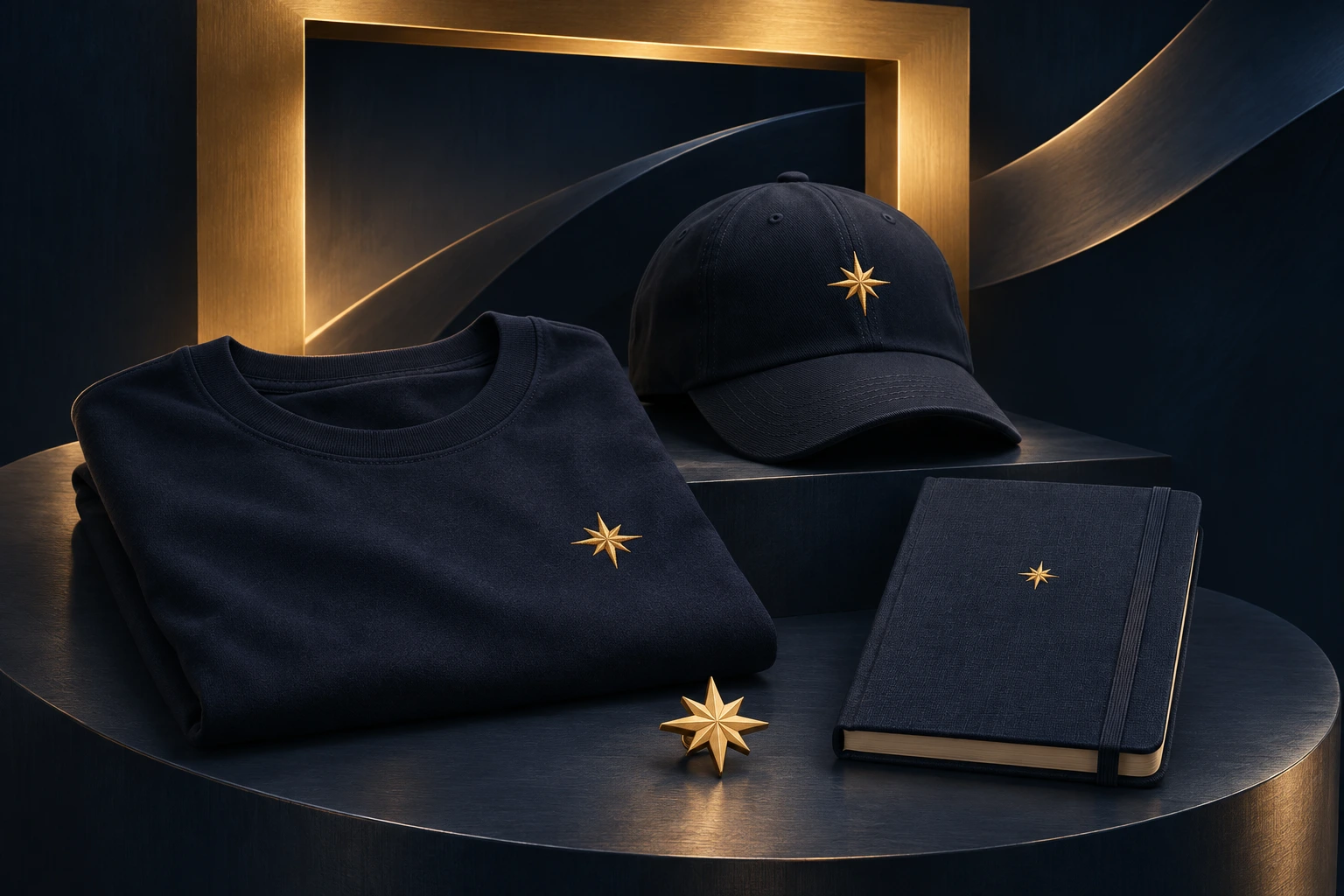
Visual concepts, not a statement of product availability, stock or ownership of facilities.
Explore merchandise concepts